Final outcome

When looking at my final garment I am very pleased with the visual outcome however I would have liked the hood to have been the same print and the jacket, but the inside be different shades of orange. If I was to do this again I wouldn’t change much apart from printing on more fabric rather that having to re print a few times. What I found most difficult with this garment was attaching the hood, even though I have done this several times I wasn’t us to the fabric. If I where to have more time in this project I would have liked to have done some embroidery into my jacked including wadding, I feel this would have made my garment more interesting and reflected more on my development work. Although I didn’t like wadding in my development work I think it would have given a 3D element to this jacket which would have looked effective. Overall I am pleased with my garment as I feel it reflects my theme and my development and I feel like you can really see this throughout my work.

When visiting Blackburn museum I thoroughly enjoyed looking at all of the old weaving missionary…I visited Blackburn museum to gather inspiration for my project, I found this rather interesting because you can compare it to the machinery we have in todays age and see how far the technology has come.


When seeing this in a building as a walk by make me think about incarceration and how can people look lonely. I liked the burgundy next to the navy blue. I think this gives the photograph a hole different look because of the combination on the colours.


This is the main thing that inspired me for my last garment. This is a traditional straight jacket was my start off point before incorporating other elements from my development work.

IMG_5814

This shoot was to experiment with background and the figure entwining with each other. There is only a few shots from the shoot because my camera deleted half of them, but I still don’t feel as these images are adequate for my sketchbook it was just to get my ideas flowing.

As iv said before I think the soft lines of the figure is a nice contrast with the bars especially when they intertwined with each other. I feel like this reflects on my theme as incarceration is so difficult relay when the typical way to incarcerate someone would be behind a fence of in confinement…but actually it could be anything along to lines of a social construction to a job. This is what I have found the most difficult part of my project. When reflecting back upon my work you can see how there has been a path through my thought proses. However how now is the time of my final garment and I have a vision in my head what I want my final outcome to be…But I feel as incarnation comes to an end you should be free. At this point in my project I don’t 100% know where I am going with my final garment but I want to regroup my thought’s and ideas and how its changed with thoughts…

For my photoshoot shown I have words from a word document projected onto my face. My original document had the words in a different font and sizes but the word document wouldn’t transferee to email so I had to change my idea. I then thought of what I could do on my phone as that was what the projector was connected to… this is the outcome. When thinking about editing my photographs and thinking about my outcome, I decided I wanted to lyer two images together, to creat the feel of the previous work in my development stage but incorporating photography.

ContactSheet-003ContactSheet-002ContactSheet-001

These are my photographs from my trailer shoot. I wanted to get the structure of the room because I thought the metal bars and the architecture of the trailer   gave the feel of imprisonment and confinement…adding to this the angles of the photograph gave a geometric feel. My intention from this shoot was to create a  series of photographs including 2 photoshoots. This has come from my development work when using the wire fence with the human figure. I think incorporating words with a powerful picture to me puts your work into context.

ContactSheet-trailer-001

ContactSheet-trailer-002.gifMy vision was to try and incorporate the figure into the shoot. I used these ties that came of the roof as a prope to creat the feel of confinement. I like the buckle in the rope, I think it addes to the mood.

ContactSheet-trailer-003.gif

When thinking about editing Ino I wanted to incorporate layering. I wanted to have a lot of shape and look like the image had aloe or depth but to also make the picture like it was murged together. I think that looks visually interesting as it gives you the sense of not knowing which photograph is on top of one another. I tried to make the words from prominent as I wanted that to be the main focus. When editing I experimented with the capacity but felt as it could intigrate more. I went into tools>normal, changed it to light. Then I wanted to increase to depth so I went to Curve and changed it in two places. I want to experiment with more of these images, I am going to next experiment with trying to make a fabric inspired by this. I am also going to experience in my sketch book with these images and do more research. Photoshoot:29th April.

edit-two

edit-one

Incarceration

The state of being confined in prison; imprisonment

When gathering my research I looked at prisons, ways to be incarcerated and the history of incarceration…Secondly to carry one my research I went to The Tate and The Walker Gallery to gather more information to broaden my knowledge on some of the artists out there who creat work linked to my theme. These are some of the images that inspired me. I tried to gather art that would trigger ideas and make it become more contextual. I tried to gather art with the intention that it might spark some artist that I could be inspired by. Many of these pieces of art have inspired me to research further into the topic as you will be able to see in my sketchbook. I think about all of these images you can really see they have similar tones and shades of colour…the main colours used, most of them might be associated with bad visual connotations. This really helped me find my path of the mood I wanted to create through out my project and made me really think about how I could put the contextual kmowlage  throughout my work.


For this technique I did spot welding to create this look. I recreated this to resemble a wired fence, this reflects on my theme incarceration as to imprison someone you need to be imprisoned. There for thats why I thought of the fence. When taking images of the wire I had an idea to try and get the wire captured from different angles so when I edited  the photographs I got different out comes for everyone.


When editing these pictures I cropped them down to emphasise the the pattern. Secondly I used the magic wand tool to remove the background. For my next step I am going to scan in either a mono print/photography of a girl being confined in a small space. I am then going to layer the wire edits on top of the girl to make a layer effect. I am going to do my edits in a range of colours. The colours I am going to use will be connotations of the word  inprisionment.


Time base


52f46135fbe890966fd23e6712c1d9b6

I chose all of these images on the fact how it made me ask myself what is time…To me time is like a measurement, i also find it structures this universe. Dose time even matter? Time has been long studied in religion, philosophy, and science. Are people just trying to find different measurements of time or is time relevant. The first image shows to me how time can be represented as being nothing… The balloons represent the nothingness of time.

1f029c5c3ad7fb55577d31339d9dd1c5

The second image says to me that time, although it is necessary is it important. This specific images gives me the imagery of time being melted away over time, or the thought of a new time…

adcbefa0337654e8b95e564c60d9e3fb

This image shows me time through the use of people, and how people can represent time through the use of the body movements. I think the light and dark in these images represent time passing. The black and white tone represent how time can’t be traced.

For these moving images i tried to get a variety of different styles incorporating different eras, I did this to show how time can be traced by the colours, patterns, and style. I think how the images are different speeds reflects time and gives it a more modern look.

I cropped my images down to the most interesting parts of the photograph. I then edited them my putting the syan filter on to get this look. I didn’t want to edit my photographs dramatically because I think it makes them look childish.

STARTING-POINT-

For this edit I wanted to show the different layers of the windows that I created. I decided not to use this piece in my final giff. I think it is to dark and I thought it didn’t really reflect the buildings I was looking at. Secondly i wanted further continue my editing but with windows… unfortunately this edit didn’t go swell as the first one. Next time i will use a more dull colour and would use a different tool to get a cleaner cut.NEXT-LESSON

I then did another photoshoot where the pictures where lighter. Although I didn’t think these images could be incorporated into my gif so I used previous pictures from another photoshoot. I still carried on with using the colour green because i thought it gave it more of an urban look.

stencil

For this piece for work I used the pen tool to create the outline of my motif. I was pleased with my motif because I felt like I could develop my ideas from my motif into a gif. I am going to add colour and overlap this motif to create a pattern.

When creating my gif I thought a lot about the colours I used. I wanted to use colours with a rustic undertone to represent the

For the first gif I created I wanted it all the same speed show my development. For the second gif I changed the speed to give it a different effect this reflects on the title time base. I feel like buildings reflect on different time periods. I am very pleased in the way my gifs have turned out. Next time I will make a gif with vibrant colours to show diver-city.

BLOGviberant

These are my two final gifs. Comparing them I like the contrast of the two of them put together. The first gif was inspired by buildings and the colours, thats why I encorperated colours accosted with buildings. The second gif was more of experimenting with colours and giving the same gif a complete new vibe. I did this to show divercity in my work. I decided to use bright colours to make the gif look different.

blog1.gifblog-2.gif

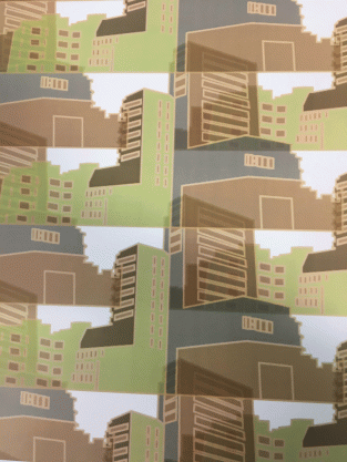
On the left hand side is my original pattern printed out on paper. On the second hand page if the pattern on fabric. As you can see the colours are different depending on what material it is on. The colour is more vibrant on the fabric however more accurate on the paper.

Buildings


When using illustrator I used a few different tools to creat these images. to creat the first image I used the star shape and put smaller sized stars into the middle of the bigger ones. I used contrasting colours to make it stand out more. The second images was really just experimenting with shapes of buildings and trying to make the image as 3D as i possibly could.

Following on from my house motif i decided to add more detail to make the image more detailed. I then changed the colour to orange and green as it is my main colour for this unit. I then made this into a pattern by selecting the image, going into objects, and then making my pattern. My next step is to play around with the diffrent patterns i can make with the same motif.

house-pattern-1

For the next piece of work i decided to make my own pattern still used my motif but in a different shape. I did this to make my pattern look less like my original pattern.house-2

For the next piece of work i took the original and put it next to two patterns different sizes.

over-jpuse-

Developing my ideas from the last session, I decided to take my own photographs and make drawings/patterns. These are a few of the photographs I took.


I then developed one of my images into a stencil. I did this by drawing around the mail outlines of the buildings and adding detail in. I did this by adding the windows and then colour.

The next step I took to was to make my stencil was to make it into a pattern. For the patten i overlapped it because I think it gives it more of an interesting look overall and dose not necessarily look like a building, which is what i want to achieve.


When thinking about how I could make my pattern more exciting I thought about the colours I could use to make it more abstract… I did this by adding colours that don’t necessarily link to buildings. I used Greens and Oranges to make the image contrast.


For my pattern I changed all of the image to a dark brown. Then when it was in a pattern I decided to change the opacity so then when the layers overlapped you could see through them. I then changed some of the colours to more natural/more toned down. I decided to have the buildings really close together so I got a more interesting image.


Following on from pattern making I decided to make an outfit encorperating the pattern. I got my template from the internet and changed the image in photoshop to look like a drawing. I then made my garments to go on my model/template. I then filled the patten different sizes into the garments.This was my final outcome…


6 week project

Our first project is titled reconstruct deconstruct.This is my jumper for my 6 week project. We will develop this by recontruct and deconstructing this jumper using all diffrent techniques, for example knitting, print, weave…IMG_3008


We then went on to using objects to make expressive marks with a range of colours paints. I used green and yellow because i think they complement each other really well.i edited this picture by cropping and duplicated the image.

I used various circles to make patterns. i used an A4 sheet of pink paper and used a paint brush with blue paint to creat a pattern. this was my first layer of my print so i edited it by duplicating the image 3 times and rotating the image. i changed the saturation to make the pink really stand out from the blue.

After playing around with the duplicate tools on photo shop i decided to get a big image and take small sections and edit them. I did this with my prints and I also did it with some on my knitting and hand knitting samples. I did this because I like the pattern that knitting gives and when it is in a smaller scale you can really see how intricate it is. To make the image more interesting I layered the image on top of each other.


I then thought of how i could incorporate knitting into my jumper. I then knitted a neck piece. I encorperated a lot of wool in my jumper because I thought it went really well with the texture of my jumper, and the colours really complemented each other.

 knitting-missing-1.gif

For the next image i look the same image i used before to edit. I then got the different type of layers and put them together to compare them and to look at the different tones.

layers-

The two images above are the same picture of my knitting sample. I edited them diffrently to show the texture and the light and the darkness of the sample. For the image underneathe I cut out circles of my duplicated image from my hand knitting and decided to make an image out of circles to show off the pattern of the knit.

circles.jpg

new-fratfrat-3

For these images I decided to crop and duplicate the image to make it look more appeling and more interesting. I also enchaced the colour to make the image more vibrant. I like the compassion of the images because I feel like the complement the original images.ContactSheet-001

This is my contact sheet for my photoshoot showing my jumper. For the first two images i decided to use a green background because i thought it would contrast with my jumper. I think shaped over to a white background because I thought this would make my jumper stand out more. My best photograph it 0020.jpg, I like the lighting and how the shadow is behind me.

pattern-1

When making this pattern I thought about how could make the image more appeling and interesting. I made a pattern out of one of my edits from my photoshoot. The three images underneath are my best pictures from my photo shoot. I edited them in photoshop with a filter called poster edges. I like how it gives the images a old school look.