
Our first project is titled reconstruct deconstruct.This is my jumper for my 6 week project. We will develop this by recontruct and deconstructing this jumper using all diffrent techniques, for example knitting, print, weave…
We then went on to using objects to make expressive marks with a range of colours paints. I used green and yellow because i think they complement each other really well.i edited this picture by cropping and duplicated the image.


I used various circles to make patterns. i used an A4 sheet of pink paper and used a paint brush with blue paint to creat a pattern. this was my first layer of my print so i edited it by duplicating the image 3 times and rotating the image. i changed the saturation to make the pink really stand out from the blue.


After playing around with the duplicate tools on photo shop i decided to get a big image and take small sections and edit them. I did this with my prints and I also did it with some on my knitting and hand knitting samples. I did this because I like the pattern that knitting gives and when it is in a smaller scale you can really see how intricate it is. To make the image more interesting I layered the image on top of each other.


I then thought of how i could incorporate knitting into my jumper. I then knitted a neck piece. I encorperated a lot of wool in my jumper because I thought it went really well with the texture of my jumper, and the colours really complemented each other.

For the next image i look the same image i used before to edit. I then got the different type of layers and put them together to compare them and to look at the different tones.

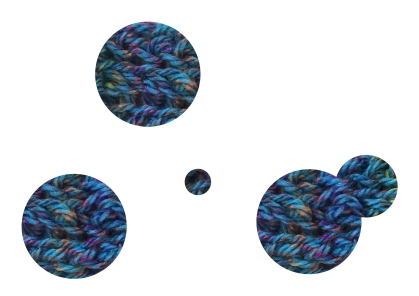
The two images above are the same picture of my knitting sample. I edited them diffrently to show the texture and the light and the darkness of the sample. For the image underneathe I cut out circles of my duplicated image from my hand knitting and decided to make an image out of circles to show off the pattern of the knit.


For these images I decided to crop and duplicate the image to make it look more appeling and more interesting. I also enchaced the colour to make the image more vibrant. I like the compassion of the images because I feel like the complement the original images.
This is my contact sheet for my photoshoot showing my jumper. For the first two images i decided to use a green background because i thought it would contrast with my jumper. I think shaped over to a white background because I thought this would make my jumper stand out more. My best photograph it 0020.jpg, I like the lighting and how the shadow is behind me.

When making this pattern I thought about how could make the image more appeling and interesting. I made a pattern out of one of my edits from my photoshoot. The three images underneath are my best pictures from my photo shoot. I edited them in photoshop with a filter called poster edges. I like how it gives the images a old school look.


